Native is a clean template with roomy spacing designed to showcase media rich blog posts. It will format itself based on how you work and what you post.
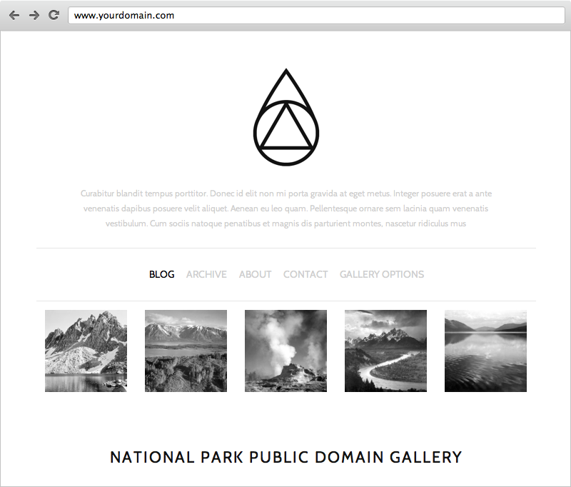
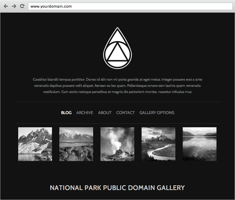
Style Mode: Presets
Native includes two preset styles, Light & Dark. These are meant to be good starting points for you to begin customizing the colors and fonts the way you want.

Style Mode: Sizes & Values
Native lets you control the widths of major website sections like the Site, Blog Content and Page Content areas. You also get control over certain sections of padding.


Independently control the Site width, Blog Content width and Page Content width with a simple slide or drag.
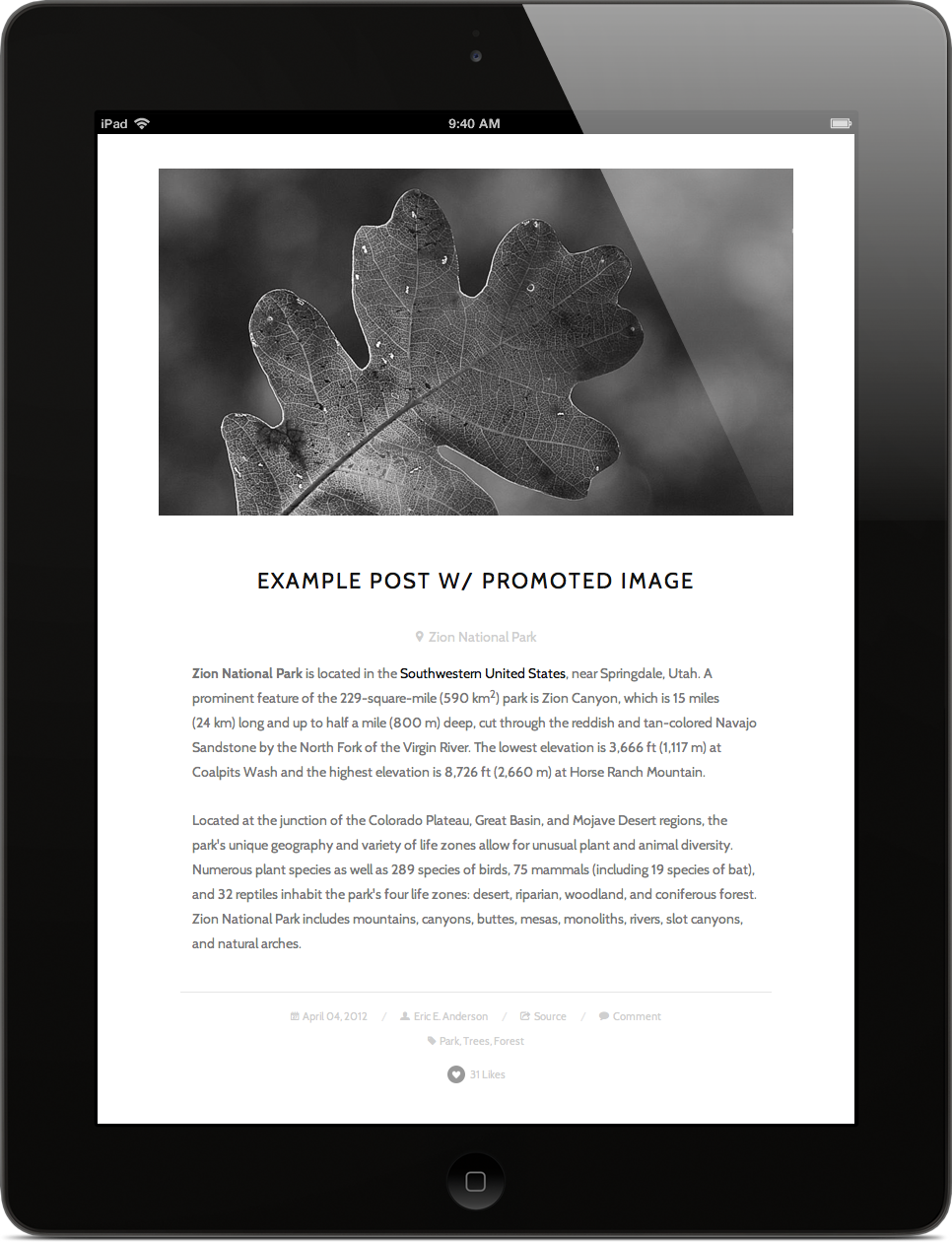
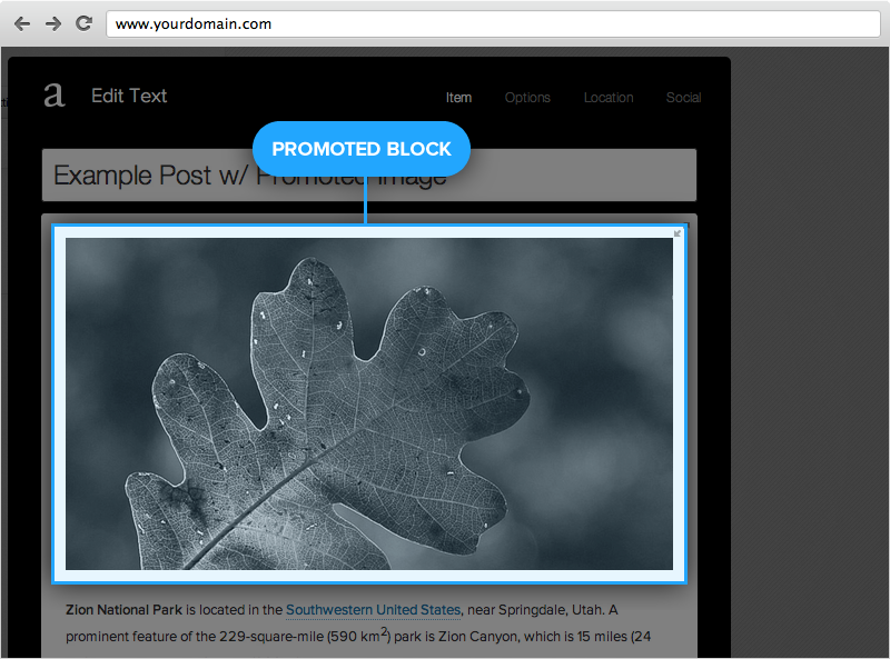
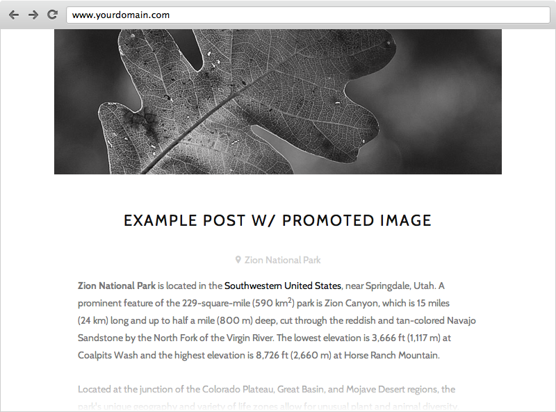
Blog Post With Promoted Block
If the very first block in your post is not floated or added to a column & contains one of the following: Image, Gallery, Video or Quote... it will 'promote' the element above the title and allow it to use the full site width.
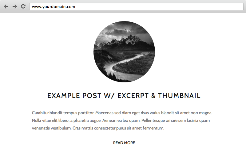
Blog Post With Excerpts & Thumbnail Image
If you use an excerpt & assign a thumbnail image to the post, Native will automatically put the thumbnail in a circle and center it above the title. It's a great feature that can dramatically change the look of your blog just by including a new behavior in your workflow.

Mobile Responsive Layouts Are Built Right In—For Tablet & Smartphone Resolutions
On smaller screen sizes, the template responds to the lower resolution and / or smaller canvas with adjusted sizes, heights and layouts so it just fits.